Pantone Color Institute choses “Very Peri” as color of 2022
In 2021 Pantone chose 2 colors once again, as it did in 2016 with Rose Quarz and Serenity, to present us a message of resilience and hope: Illuminating & Ultimate …
In 2021 Pantone chose 2 colors once again, as it did in 2016 with Rose Quarz and Serenity, to present us a message of resilience and hope: Illuminating & Ultimate Gray. A clear statement of intent, symbolizing the light at the end of the tunnel after the toughest phase of the pandemic. “We need to feel that everything is going to get better; it is essential for the human soul.” – explained Pantone.
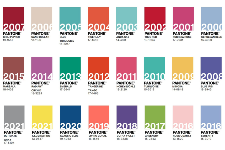
Fortuitously, Pantone also nailed the colour of 2020, Classic Blue, which not only represented serenity and confidence, but also the general mood of humanity. In the press release by the end of 2019, we could read “Classic blue is a reflective shade of blue encouraging resilience”. A premonitory sentence of what was about to come.
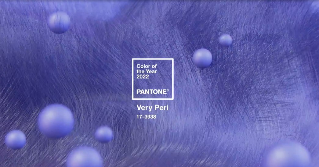
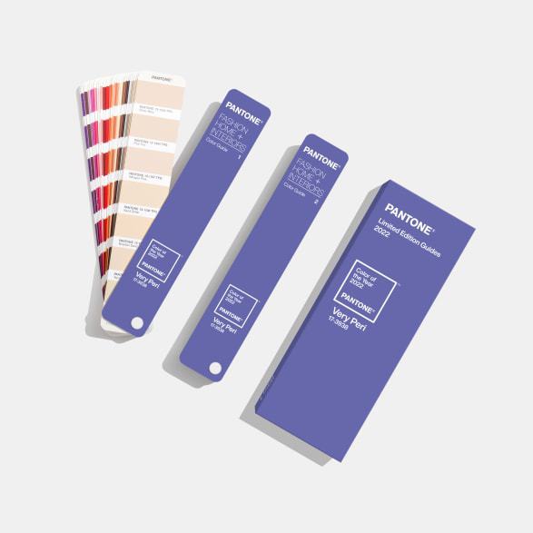
Pantone has for the first time created a new custom colour for 2022. Specifically, PANTONE 17-3938 Very Peri is a color that stimulates ingenuity and personal creativity and illustrates the fusion of modern life.

According to Pantone, it is a symbol of the spirit of our global age and the transition we are living through. A colour that helps us navigate this change and opens a door to the virtual world where we can create and explore new colour possibilities in digital spaces, encompassing blue tones with a violet-red undertone.
As Leatrice Eiseman, executive director of the Pantone Colour Institute, points out “As we move into a world of unprecedented change, the selection of PANTONE 17-3938 Very Peri brings a novel perspective and vision of the trusted and beloved blue colour family, encompassing the qualities of the blues, yet at the same time with its violet-red undertone, PANTONE 17-3938 Very Peri displays a spritely, joyous attitude and dynamic presence that encourages courageous creativity and imaginative expressions.”
Vice President Laurie Pressman, adds “The Pantone Color of the Year reflects what is taking place in our global culture, expressing what people are looking for that colour can hope to answer.”
Pressman further emphasizes, “Creating a new color for the first time in the history of our PANTONE Color of the Year educational color program reflects the global innovation and transformation taking place. As society continues to recognize color as a critical form of communication, and a way to express and affect ideas and emotions and engage and connect, the complexity of this new red violet infused blue hue highlights the expansive possibilities that lay before us”.
Pantone Color of the Year 2022 in Fashion and Textiles
As indicated by the Pantone Color Institute, PANTONE 17-3938 Very Peri is a warm and friendly shade of blue with a carefree confidence and a joyful attitude that encourages uninhibited expression and experimentation.
This enthusiastic blue shade shows a dynamic presence capable of creating incredible colour harmonies, to take on different appearances through application to different materials, finishes and textures, from shimmering metallics, glossy sheens and high-tech materials, to handmade looks and natural fibers. A colour that is very reminiscent of the bold pastel shades used in sportswear in the 90’s and can be combined with an infinite number of colors.
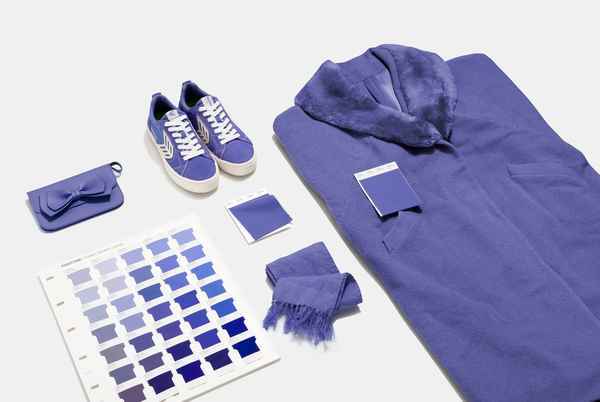
For interior textiles, it brings a sense of playful freshness through unusual colour combinations that can stimulate our creativity by adapting to a wide range of materials.
Pantone is the global leader in colour standards for the fashion industry with its Fashion, Home + Interiors (FHI) colour system that adapts its colour charts to the most used textile materials such as cotton, nylon, or polyester.
How Pantone chooses the colour of the year?
Pantone Color Institute is a world reference in colour. This American company is the creator of the Pantone Matching System (PMS), a system of colour charts or palette that allows to catalogue and quickly identify all the colors by families and put them at the service of fashion and design, defining colour trends.
The process of selecting the “Color of The Year” is done through an in-depth study and analysis of trends in materials, textures, and effects in various sectors such as the fashion industry, entertainment industry, touring art collections, new emerging artists, tourist destinations, and new lifestyles among others.
Pantone’s colour of the year influences product development, purchasing decisions, new industrial designs, and interior decoration. Of course, it has a big impact on the fashion industry, as designers rely on Pantone’s colour charts to develop their creations. We will see it in the spring summer 2022 season.


